For this project I had to design a creature that had some element of Lava in its biology. I was allowed to use any 2D or 3D method I wanted to use.
Pretty early on I decided to use 3D modelling to build my lava monster.

I began by looking at multiple sources of inspiration, including work from the previous class in which I learnt how to use layer effects in Photoshop to create glowing lava.
I decided to design using both Maya and Mudbox a lizard similar to a Komodo Dragon in size and appearance. I had an image in my head of the scales on its back being replaced with rocks through which lava was visible.
I began shaping the body after looking at images and videos of Komodo Dragons and how they move. Making the body in Maya was simple, I was only making a low poly version which I then could take into Mudbox and develop further, so all I needed was the general shape of the lizard I wished to create.
 |
| Basic shape. |
After looking at lizards and how they moved I decided to bend the body slightly to make it look as if it was moving and not just a still model. I did this using the Non Linear bend tool.
Lizards sway slightly and can appear to slither when moving.
How a Lizard Moves - https://www.youtube.com/watch?v=R7sEUdqcvxw
Lizards sway slightly and can appear to slither when moving.
How a Lizard Moves - https://www.youtube.com/watch?v=R7sEUdqcvxw
 |
| Bending the body. |
After I did this I began adding the legs and completing the torso. I added in the jaw using the extrude and scale tools.


Once the legs had been added it was time to add the feet. The feet and claws were difficult to create, but I could afford for there to be some impurities with the model at this stage.

As soon as the low poly body was complete I went about adding rocks and boulders to its back to create thick scales from which lava would flow from.

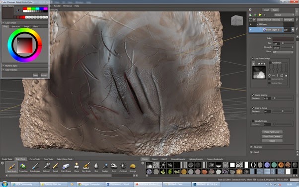
The low poly was now ready to be taken into Mud Box to be turned into a high poly model.

Immediately I turned up the level of polys using shift+D. This smoothed the mesh and made it easier to model using the sculpt tool. However I began to encounter problems almost immediately.

The model I had created in Maya had lots of geometry that caused problems when I was trying to sculpt the lizards skin. The hard edges of the low poly version also caused me problems, its belly and sides looked very square and unnatural. The vicious look of a Komodo Dragon was also missing, instead it looked more like a family pet. I felt that to correct all of these mistakes would take too long to fix and that my best option was to start again. However at this point of the project I became sidetracked with other work and put this on hold for the meantime.

I waited a while then came back to the project after spending some time thinking and planning what to do next, I had also spent time speaking with other members of my class and noticed that some of the designs they had done were of a lizard or inspired by a lizard. I decided that it would be best to use Photoshop along with some of the painting/ editing techniques I have learnt recently to create a new monster.
Second Attempt
I opened up Photoshop and began sketching lightly using a tablet until an idea came to me. Since taking part in life drawing classes I have become much more comfortable drawing the human anatomy, it has become much easier to approach and draw, I naturally started drawing the shape of a human. An idea came to me pretty quickly of a giant fighting over territory with another giant. I would say a primary source of inspiration and the reason as to why I thought of this first would be the stone giants from the recent Hobbit film. The Hobbit: An Unexpected Journey. I certainly want the visual style of the stone in my piece to resemble the stone on these giants. Click on the link below to see the giants fighting.
Drawing a giant seems cliche when thinking of the words 'lava monster'. When you think of lava you naturally think of the volcano it comes from. Volcano's are generally massive, they are furious and violent; anyone designing a creature inspired by such a thing cannot help but draw big. I think this is why creatures such as dragons and giants in fantasy worlds tend to resemble mountainous terrain or lava because we naturally associate them with giant mountains and volcanoes. Lava also acts as a perfect ingredient for an evil character design, its red/ orange and very very hot. We are surrounded by red warning signs which warn us of danger, so designing a character using a red colour palette is a good way to say to an audience 'stay away im dangerous'. Red/ orange is also the colour perceived quickest by the human eye which is why brake lights and other day to day objects are red, they are made like that specifically to catch your attention, a character with red and orange within its design will have the same effect. Its also easier to artificially create a focal point within the painting using hot colours.
Since I had settled on what to draw and the reason behind drawing it I had no problem continuing with this design.
I wanted this character to be slightly top heavy to create a large presence in frame. I also wanted it to be stocky to create the appearance of strength. Since he would be fighting another giant I wanted him to have a weapon of some sort, I researched rocks and minerals and came across an image of a giant crystal. This would be a great alternative for an arm, so I drew one in place of his left forearm. I placed the giants head on top of the crystal to make it look as if it has just been ripped off with its body on the floor next to him.

I started to refine my drawing and add more layers to its design. I did this to allow me to keep momentum and remain inspired. This stage also allowed me to experiment with possible features that I could add to his body such as growing crystals on his back.

When I had finalized his design I went online and copied in some images of rocks and began to build up the limbs using photographs. I did this so that I could use them as reference when painting, it also allowed me to see how light interacts with the surface of a rock. I noticed that unlike organic material rocks don't have a gradual shadow cast across their surface. It is all made up of one tone until you reach a crack or an edge then it becomes suddenly very dark. All of the shadows are solid black with very little colour or light able to peak through.

I created a colour palette for myself using the photos for use later on. Then I created a layer on top of the photos and began to draw the outlines and shadows using the pictures as reference.

Using the lines I had drawn I created a base layer, this became my masking layer. I then began to paint on top of this base layer using the colours on the palette and a variety of brushes.

Once the giants base layer was complete I created a background using images sourced from the internet.
 |
| Background created using Photoshop. |
I placed the background in the scene with the giant. When I was looking at images of lava to get inspiration at the start of this project I noticed clouds of steam being created whenever hot lava came into contact with cool water. It boils the water surrounding it and creates steam. I thought this would be great to add into my piece to create a sense of atmosphere. It also works with the orange and blues in the background, cool colours clashing with hot colours, just like the hot lava and the cool water, it creates steam. Blue and orange are opposites on the colour wheel so contrast nicely against each other, lots of games use this to their advantage when creating box art (Battlefield 4, Mass Effect 3, L.A. Noire, Starcraft 2 ect) I have made use of this here in My piece. I also added in jets of steam shooting from the dead giants corpse and his head, to make it look like he was hurt or dying. The last thing I added in this stage was dirt and dust falling from the giants head as it was lifted away from his body. All of this creates a greater sense of depth and realism which is greatly needed when trying to create a believable scene.

Last but not least I added the most important part of the design; lava. You can see how I placed the greatest amount on the giants chest, this creates a focal point and draws your eye towards the main character before you look at the dead giant. Creating a main focal point helps refine the overall image.
Placing the lava in the center of his chest makes it look as if it is his main source of power. From this point I stretched thin veins of orange out across his body. However I was careful not to overpower the center point by using too much colour. So I distributed the lava as evenly as I could.
I even added blue lava/ plasma to the defeated giant to show they were from the same species but create a difference between them, this in turn becomes a catalyst for conflict. It also helps to break up the scene so it doesn't blend the two giants together to make it look as if the body parts belong to the giant in the center. Orange and blue lava also works well with the colour palette used in the background.
 |
| Finished piece. |
Overall I am happy with this outcome. It took a while to get here but I feel it was well worth the time invested. It provided Me with some experience across both 2D and 3D software and showed Me where I have went wrong and need to improve. I do feel though that my ability to use Photoshop has come on greatly recently, this is mainly down to experimenting with new techniques and practicing with a tablet. There are things however that I do feel could have gone a lot better with this project. Time management being one. It was all too easy to get sidetracked doing other work, I must be wary moving forward and make sure that doesn't happen again. Also before I try using Mud Box again I think its important I get some practice with it. I wasn't really aware of what would happen if you place bad geometry into Mud Box, i'm sure it could be fixed by someone used to using Mud Box however I didn't have the time to fix it myself. Regardless of all these drawbacks I enjoyed working on this piece and I have learnt a lot throughout this project. My final outcome was sound by my standards and demonstrates to Me that I am improving with Photoshop, if I was to revisit this project I would thin the thick black outlines and try to add enough light and colour to the piece that the giant wouldn't need black outlines to hold its form. That is something I would like to work on as to date I haven't produced a piece that has been able to hold itself without outlines.